Parameter Rendering
When defining an action in a FlowRunner™ extension, you can control how each parameter appears in the Flow Editor’s configuration panel using the @paramDef annotation. This annotation defines the parameter’s data type, label, and additional UI rendering options.
By default, parameters are rendered as input fields that integrate with the Expression Editor. However, you can customize how a parameter is displayed by specifying a UI component using the uiComponent property inside the @paramDef.
This allows you to render checkboxes, dropdowns, date pickers, and other input types to match the nature of the parameter.
Example
The sample below demonstrates how to declare parameters with various supported UI components. Scroll horizontally to see all @paramDef declarations:
/**
 * @description Demonstrates all supported FlowRunner™ UI input types using @paramDef annotations.
 *
 * @route POST /demoUiTypes
 * @operationName Demo: UI Input Types
 *
 * @appearanceColor #808080 #A9A9A9
 *
 * @executionTimeoutInSeconds 60
 *
 * @paramDef {"type":"Boolean","label":"Checkbox Option","name":"checkboxOption","required":false,"description":"A boolean input using a checkbox.","uiComponent":{"type":"CHECKBOX"}}
 * @paramDef {"type":"Boolean","label":"Toggle Option","name":"toggleOption","required":false,"description":"A boolean input using a toggle switch.","uiComponent":{"type":"TOGGLE"}}
 * @paramDef {"type":"Number","label":"Numeric Input","name":"numericInput","required":false,"description":"A number input using a plain numeric field.","uiComponent":{"type":"NUMERIC"}}
 * @paramDef {"type":"Number","label":"Numeric Stepper","name":"numericStepper","required":false,"description":"A number input with a stepper UI.","uiComponent":{"type":"NUMERIC_STEPPER"}}
 * @paramDef {"type":"Number","label":"Date Picker","name":"datePicker","required":false,"description":"A date input that returns a timestamp.","uiComponent":{"type":"DATE_PICKER"}}
 * @paramDef {"type":"Number","label":"Date Time Picker","name":"dateTimePicker","required":false,"description":"A date/time input that returns a timestamp.","uiComponent":{"type":"DATE_TIME_PICKER"}}
 * @paramDef {"type":"String","label":"Dropdown Option","name":"dropdownOption","required":false,"description":"A dropdown input with predefined values.","uiComponent":{"type":"DROPDOWN", "options":{"values":["Option A", "Option B", "Option C"]}}}
 * @paramDef {"type":"String","label":"Multiline Text","name":"multiLineText","required":false,"description":"A multi-line text area for long strings.","uiComponent":{"type":"MULTI_LINE_TEXT"}}
 * @paramDef {"type":"String","label":"Single Line Text","name":"singleLineText","required":false,"description":"A single-line text input field.","uiComponent":{"type":"SINGLE_LINE_TEXT"}}
 * @paramDef {"type":"String","label":"File Selector","name":"fileSelector","required":false,"description":"A file selector from Backendless Files.","uiComponent":{"type":"FILE_SELECTOR"}}
 *
 * @sampleReturn {"success":true}
 */
async demoUiTypes(
  checkboxOption,
  toggleOption,
  numericInput,
  numericStepper,
  datePicker,
  dateTimePicker,
  dropdownOption,
  multiLineText,
  singleLineText,
  fileSelector
) {
  // Demo only - implementation intentionally left empty
}
When used in FlowRunner™, the parameters appear in the UI with appropriate input types:
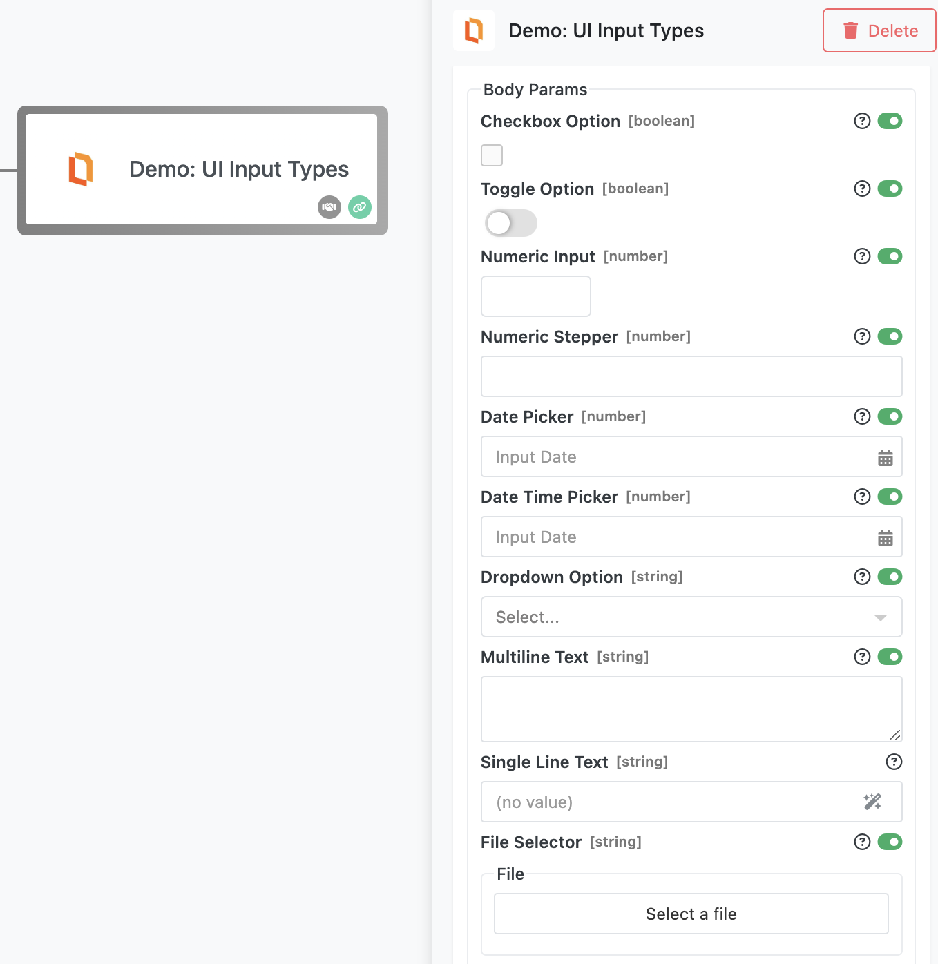
Supported UI Components
Below is a summary of all supported uiComponent.type values and their expected behavior:
| UI Component | Parameter Type | Description | Required Options |
|---|---|---|---|
CHECKBOX |
Boolean |
Displays a checkbox input. | None |
TOGGLE |
Boolean |
Displays a toggle switch. | None |
NUMERIC |
Number |
Displays a plain number input field. | None |
NUMERIC_STEPPER |
Number |
Displays a number input with increment/decrement buttons. | None |
DATE_PICKER |
Number |
Displays a calendar input. Returns a timestamp (milliseconds). | None |
DATE_TIME_PICKER |
Number |
Displays a combined date and time selector. Returns a timestamp. | None |
DROPDOWN |
String |
Displays a dropdown list with predefined options. | values (array of strings) |
MULTI_LINE_TEXT |
String |
Displays a textarea for long-form input. | None |
SINGLE_LINE_TEXT |
String |
Displays a single-line text input. | None |
FILE_SELECTOR |
String |
Opens a file browser for selecting a file from Backendless Files. Returns file path. | None |
Notes
- All UI components still support the Expression Editor, unless the field is restricted by type (for example, toggles and checkboxes).
- The
DROPDOWNtype requires a list ofvalues, provided in theoptionsproperty. - The
TIME_PICKERtype is not currently implemented and should be avoided for now.
Required vs Optional Parameters
Every @paramDef includes a required property. This flag determines whether the user must provide a value for the parameter in the FlowRunner™ UI.
- If
requiredis set totrue, the field is marked as mandatory. FlowRunner™ will prevent the user from running the flow until a value is provided. - If
requiredisfalse, the input is optional, and the user may leave it blank.
This distinction is especially important when using inputs like dropdowns or toggles. Make sure your action code/logic accounts for optional parameters by including conditional checks in your implementation.
Dictionary Arguments
If you need to render a list of options that are not static, but instead retrieved from an API or depend on other values in the flow, use a dictionary argument instead of a predefined dropdown.
Dictionary arguments allow your parameter to be powered by a custom function that dynamically fetches the list of options at runtime.
For example, you might use a dictionary to: - Let the user select a Slack channel from their workspace - Display available Airtable bases or Google Sheets tabs - Retrieve filtered items from an external API
To learn more, see the Developing an Action with Dictionary Arguments chapter.